When Financial Clarity Looks This Clean: Inside a High-Impact CFO Dashboard

Gurgaon, Haryana Feb 26, 2026 (EMWNews.com) – There’s a difference between seeing numbers and understanding them.
Most businesses already have data. Revenue numbers sit in accounting software. GST figures live in returns. Expenses are stored somewhere in spreadsheets. But when leadership needs answers quickly, they don’t need scattered reports — they need clarity on one screen.
That’s exactly what a well-structured CFO Dashboard delivers.
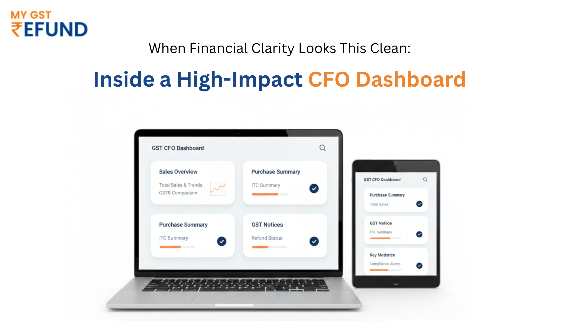
If you look at a properly designed dashboard — especially one built with a dark blue base and sharp orange highlights — you immediately notice something: it feels controlled. Clean sections. Focused metrics. Clear hierarchy. No clutter. No guesswork.
And that visual discipline reflects financial discipline.
A Layout That Speaks Before You Read
The strongest CFO dashboard design doesn’t overwhelm. It organizes.
At the top, key financial indicators stand out — revenue, expenses, profitability. They are not buried in tables. They are highlighted, structured, and instantly readable.
The middle section typically shows performance trends. Line graphs display revenue movement. Bars compare expense categories. The contrast between dark blue backgrounds and orange data lines makes critical shifts easy to spot within seconds.
Lower sections often focus on operational or compliance insights — GST payable, receivable tracking, or other statutory figures depending on business structure.
The layout itself communicates priority.
And that’s the difference between a decorative dashboard and a decision-making tool.
Why Visual Structure Changes Financial Conversations
When financial data is presented in a scattered way, meetings turn into explanation sessions.
When data is presented in a structured CFO Dashboard, meetings turn into decision sessions.
Instead of asking:
“What are our numbers?”
Leadership starts asking:
“Why did this change?”
“What should we adjust?”
“Where should we invest next?”
That shift only happens when the financial story is visually clear.
Whether built in CFO dashboard Excel, a CFO dashboard Power BI environment, or specialized CFO dashboard software, the goal remains the same — simplify complexity without losing accuracy.
Moving Beyond Basic Samples
Many businesses begin with a CFO dashboard sample downloaded online. It usually includes basic charts — revenue, profit, and expense pie graphs.
But a real business needs more than a template.
It needs alignment with how the company actually operates.
For example:
A GST-registered business needs visibility not just on income and expense, but also on tax positioning. Outstanding liabilities. Filing alignment. Impact on working capital.
A dashboard connected to platforms like My GST ensures that financial tracking and statutory data are not disconnected. When both sit in one view, financial planning becomes grounded in compliance reality.
That’s when the CFO Dashboard becomes more than reporting — it becomes control.
Precision Over Decoration
Some dashboards look impressive but lack relevance. Too many charts. Too many colors. Too many metrics competing for attention.
The design you shared reflects a different philosophy.
Dark blue establishes seriousness and authority.
Orange highlights draw focus only where action matters.
Whitespace ensures readability.
It doesn’t try to impress. It tries to inform.
That’s what makes it powerful.
The real strength of CFO dashboard examples like this lies in restraint. Showing only what leadership truly needs — no noise, no distraction.
Data That Drives Action
A strong CFO Dashboard answers critical operational questions instantly:
Are revenues trending upward consistently?
Is expense growth aligned with revenue growth?
Is profitability stable?
Is tax exposure under control?
When these answers are visible in one structured environment, the CFO’s role shifts from compiling reports to guiding strategy.
And that transformation is where businesses gain an advantage.
Not Just Reporting — Direction
Spreadsheets still have value. CFO dashboard Excel files will continue to exist. Power BI will remain a powerful visualization engine.
But the difference is integration and purpose.
A CFO Dashboard that pulls structured financial and GST data together eliminates fragmentation. It reduces manual consolidation. It ensures that numbers shown to leadership reflect the same reality as statutory filings.
That consistency builds confidence — internally and externally.
Clean Data. Clear Decisions. Confident Growth.
The visual tone of your dashboard says something important: control.
It signals that finance is not reactive. It is organized. Measured. Forward-looking.
And that is exactly what growing businesses need.
A thoughtfully designed CFO Dashboard doesn’t just show performance — it defines how performance is reviewed, questioned, and improved.
When financial information is presented this clearly, growth stops feeling uncertain.
It becomes calculated.
Source :MyGST Refund
This article was originally published by EMWNews. Read the original article here.
FREE Money In 2024 The Average Family Will Receive $22,967 On Gov’t Grants If They Apply.
There’s nothing complicated about it, Get Your FREE Money!
NO CREDIT Check – Bankruptcy OK – Apply Online
https://GrantsAvailable.com
[youtube https://www.youtube.com/watch?v=a0g8UEDB47Y?si=cKR-DuN-n7I_rB4d&w=560&h=315]